There is always a fine line when it comes to styling corporate events. We want to make it look visually appealing, show-stopping and give you that all-around ‘wow’ moment. But we don’t want to look at it and instantly think it looks like a Wedding.
When it comes to Corporate styling, it’s important to bring a slightly masculine touch into the event. This comes through with the choice of colours, florals and textures.

Florals
A floral selection that features a lot more greenery is going to help assist with making the event feel more masculine and corporate in nature. Elements such as roses, whimsical stems and coloured florals will instantly make the floral arrangements feel and look more like they are on the Wedding spectrum.
Picking the shapes of your florals is also a really important element to consider when deciding on your design. Picking floral shapes that are more compact and linear in design are going to suit the style a lot more.
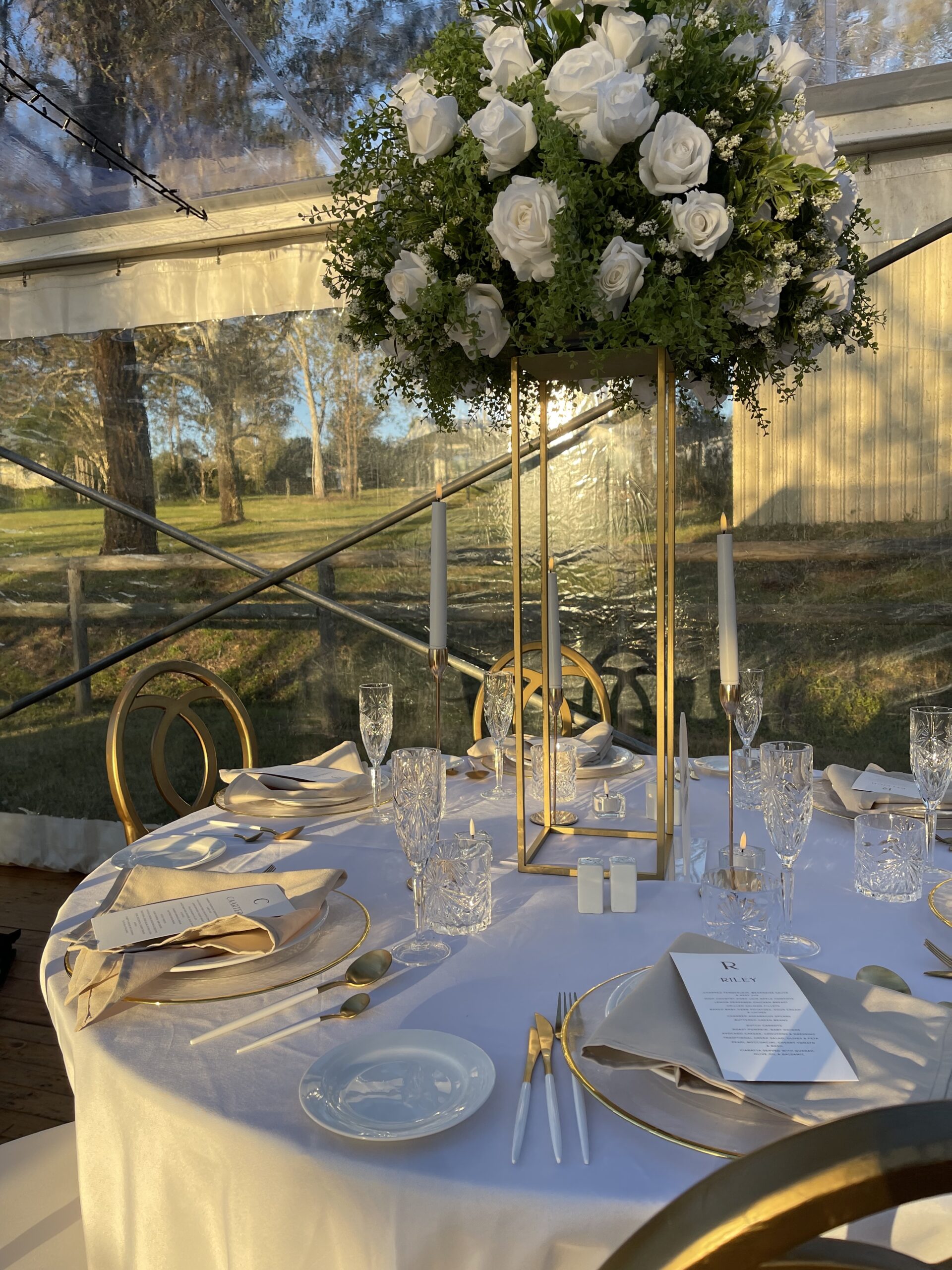
Floral shapes that are more along the lines of round balls, or smaller whimsical designs will bring the Wedding feel back to the styling.
If you take a look at the florals in these 2 images below, you can see the round ball combined with the height of the Wedding florals make them feel very Wedding like, in comparison to the lineal nature of the corporate event florals.

Colour Palette
This one can be tricky, because the colour palettes for events are often determined by a brand’s corporate colours. A brand’s corporate colours, often help us to define the vibe of the event and often tie it together.
What I mean by this, is if your brand colours are pastel pink, orange, and yellow. It is likely you will be wanting a light, bright and summery event, in which case if your styling lines up with more of a pretty sort of ‘wedding vision’, then this is okay, and is most likely going to be on brief and expected by your guests anyway.
In the event that you are looking to ditch the corporate colours, solid colours with a darker palette are always a safe bet when it comes to styling your corporate event.
Colours in the black, green, navy, and red palette will create the dark formal mood required to elevate your Corporate event to the next level.
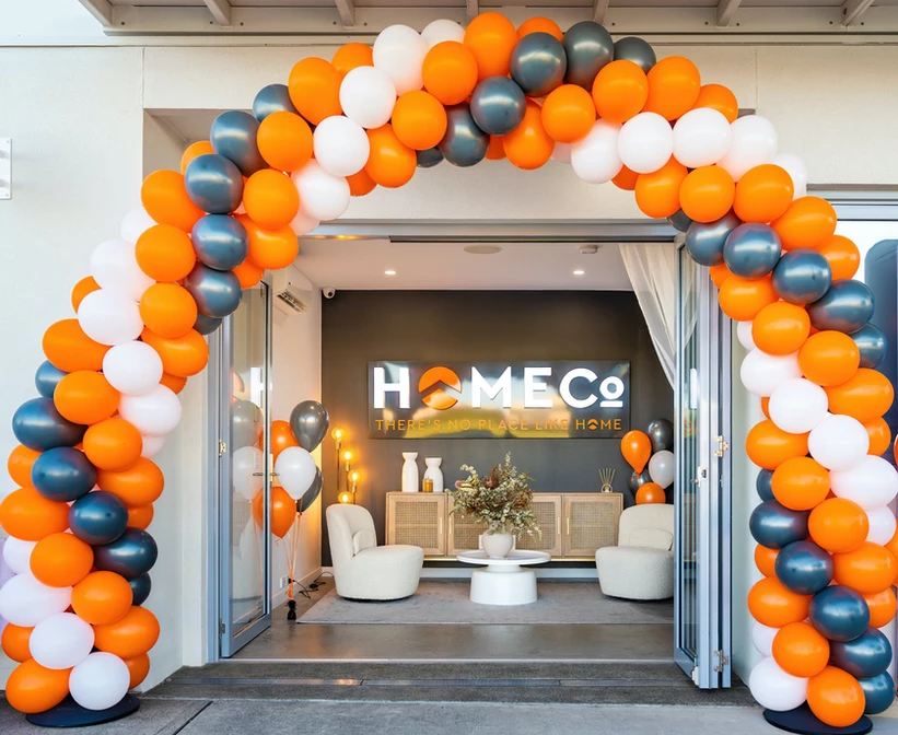
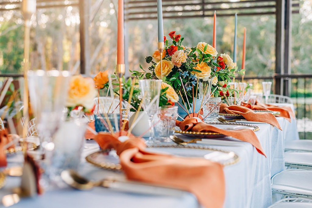
Have a look at the below examples, they both use orange as a feature element, but with a change of their accent colours has turned the orange either very feminine and pretty for the Wedding, or kept it really corporate for the office opening.
Textures and metals
This is something that I feel often gets overlooked when it comes to styling for corporates! Textures are so important when it comes to any form of styling to ensure it is lifted to the next level. I find working with metals such as gold, silver, and or copper within a design can help to bring those more masculine tones in and help it feel less pretty.
The biggest thing to remember when it comes to Corporate events is they don’t have to be boring! Just because they’re not ‘pretty’ as such, doesn’t mean they have to be boring, dull and ugly.
Being smart with your colours, textures and florals can mean that you still have your wow event, just minus the feminine flair.